
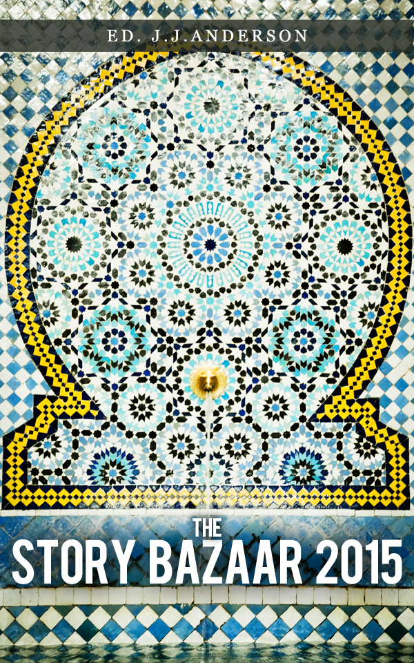
So to the last stage of publishing The Story Bazaar Compendium 2015 – the galley proof.
A ‘galley proof’ is a preliminary version of a publication, so called because in the days of letterpress printing a galley was the tray into which the individual pieces of type were placed. I am at the galley proof stage in the work on the Story Bazaar Compendium 2015 and have taken away with me the first printed proof copy for detailed review. I have already reviewed it electronically, using Sigil. This is, in part, a proof reading exercise, to spot any misspellings or mistakes, but it is also about the design of the book and its pages. Unsurprisingly, I’ve already found some changes which need to be made.
Have I used complimentary typefaces ( because, at present, I have used more than one )? Does this work or should I revert to having just one typeface? Are my fonts the right size? What about the ornamentation?
Printer’s ornaments are commonly used in non-fiction books. They are used in fiction too, usually with chapter headings – a good modern example of  this is the sailor’s knot designs which were used in the first UK edition of ‘The Shipping News’ by E. Annie Proulx . There were no printer’s ornaments in ‘The Village’. Research has shown, however, that readers absorb factual writing in a different way to that in which they absorb fictional narrative. So, without the narrative ‘sweep’ of a gripping story line, but with a succession of sections, arguments, facts etc., spacing the text, breaking it into manageable chunks, is better for the reader. In modern text books, one sees the frequency with which textboxes are used is growing and publishers use different fonts and typefaces to break things up.
♥♥♥
But, now, as always, printers also use ‘ornaments’. These range from the standard asterisk to elaborate designs based on plants or other natural shapes. There are many different kinds – for example the ‘vignette‘, a design or pattern without a border, originally an engraved design printed using a copper-plate press and often used, like a ‘wood-cut’, to separate sections or chapters. Wood-cuts and vignettes were much beloved of the Arts and Crafts movement, with elegant and complex patterns, often drawn from natural forms, filling large parts of the available space on the page – as you can see in any book published by Kelmscott Press ( this link is to University College’s copy of ‘Maud‘ by Alfred, Lord Tennyson ). Borders are also printers ornaments. These were common in 19th century books, fiction and non-fiction, when there was border decoration around the central text, good examples are Victorian cookery books.
***
The oldest printer’s ornament is probably the asterisk, in its various forms, which is said to have been in continuous use as a graphic symbol for over 
 5,000 years and has been found in Sumerian pictograms ( see Bringhurst ‘The Elements of Typographic Style‘ ). Printer’s marks, such as the pilcrow and ampersand have Latin roots ( the former was an evolution from the slashed through ‘C’ of ‘capitolum’ to denote chapter, the latter a merger or composite of the ‘E’ and the ‘t’ of the Latin ‘Et’ ), as do some printer’s ornaments, like the Hedera, or ivy-leaf, though that has also been found in earlier Greek texts.
Somewhat more modern is the dingbat. This isn’t a word from the computer age, as I had imagined, confusing ‘Wingding’s, which you can find in the top left-hand ‘font’ section of your Microsoft Word program, with ‘dingbat’. In fact, ‘dingbat’ is a slang word. In the US it is used as a substitute for other words, which may, possibly, have been forgotten, so, in UK English, ‘thingy’ or ‘do-dah’. ( If US readers know otherwise, please correct me. ) Printer’s ornaments could indeed be described as ‘thingies’ or ‘do-dahs’. In the Antipodes, however, ‘the dingbats’ are the delirium tremens, ( brought on, doubtless, by over-indulgence after a hard day’s type-setting ).
♣♣♣
Some dingbats are available in Microsoft programmes, as Wingdings, but there are far more available if you know where to look. Many are free. See sites like Dingbat Depot or 1001 Free Fonts. I haven’t used many in the Compendium and those I have used are traditional and appear on title pages or with headings. I am very conservative in my printing, I have discovered, or perhaps I just realise that I’m not yet technically proficient enough to be adventurous successfully. Barring accidents and the completely unforeseen, The Story Bazaar Compendium 2015 will be available for sale as a Print on Demand book on Amazon by 18th December ( post permitting ).
If you enjoyed reading this article, you may also like From Gutenberg to Google When is a font not a font? What’s in a name?

 RSS – Posts